Introduction
- You have already learned how to collect and organize data in previous chapters.
- However, just gathering and arranging data is not enough.
- Imagine trying to make sense of pages filled with raw numbers and figures—
- it would be overwhelming and confusing!
- To truly understand and analyze data, it needs to be presented in a clear, compact, and engaging manner.
- This chapter focuses on the art of presenting data effectively, making it not only usable but also easy to comprehend.
Forms of Presentation of Data
Generally, data can be presented in three main forms:
- Textual/Descriptive Presentation
- Tabular Presentation
- Diagrammatic Presentation
Textual/Descriptive Presentation of Data
In textual presentation, data is explained within the text itself. This method is more suitable when the amount of data is not too large. Consider the following examples:
Case 1:
During a bandh on 08 September 2005, protesting against the increase in petrol and diesel prices, 5 petrol pumps remained open while 17 were closed. Additionally, 2 schools were closed, and 9 schools continued to operate in a town in Bihar.
Case 2:
According to the Census of India 2001, the population of India had reached 102 crores, with 49 crores being females and 53 crores males. Of the total population, 74 crores lived in rural areas, while 28 crores resided in urban areas. There were 62 crores of non-workers compared to 40 crores of workers across the country. The urban population had a higher proportion of non-workers (19 crores) compared to workers (9 crores), whereas in rural areas, there were 31 crores of workers out of a total population of 74 crores.
In both examples, data is presented solely through text. The main disadvantage of this approach is that the reader must go through the entire text to understand the information. However, this method can effectively highlight specific points in the presentation.
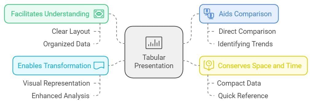
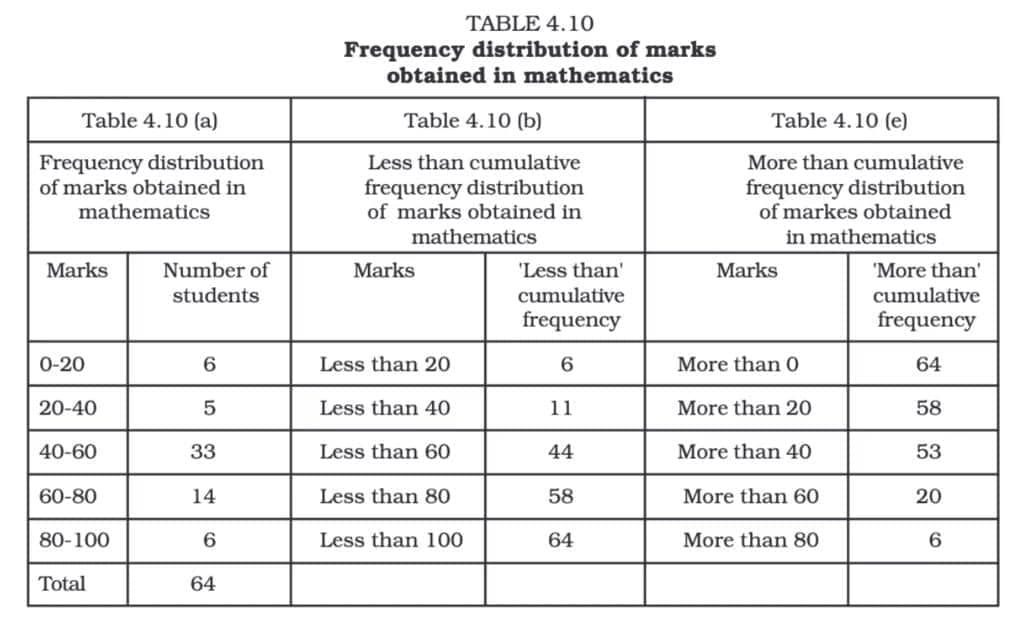
Tabular Presentation of Data
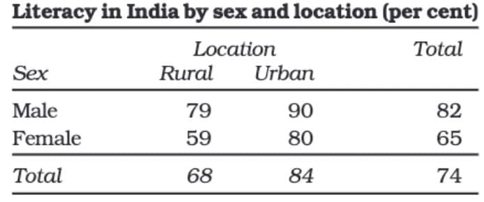
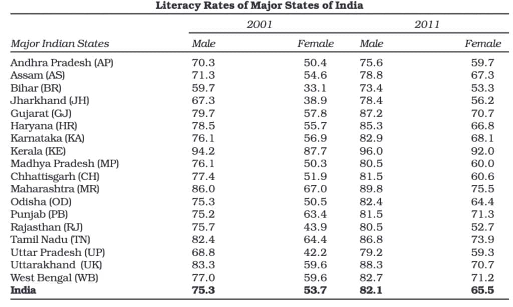
In a tabular presentation, data is arranged in rows (horizontal) and columns (vertical). For example, if we look at a table showing literacy rates, it might have three rows (male, female, and total) and three columns (urban, rural, and total). This 3 × 3 table contains nine pieces of information in nine boxes called "cells." Each cell shows a piece of information that connects an attribute like gender (male, female, or total) with a number (literacy percentages of urban, rural, and total populations).
The biggest advantage of tabulation is that it organizes data for easier analysis and decision-making. The classification used in tabulation can be of four types:
Qualitative Classification
When data is classified based on attributes like social status, nationality, or physical status. For example, in the literacy table, the attributes used are gender and location, which are qualitative.
Quantitative Classification
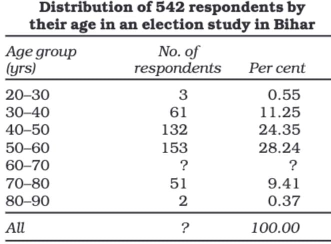
When data is classified based on measurable characteristics like age, height, income, or production. Classes are formed by setting limits, known as class limits, for the values under consideration. For instance, a table showing age groups and their corresponding populations.
Temporal Classification
In this classification, data is organized based on time. It can be classified by hours, days, weeks, months, years, etc.
Spatial Classification
When data is classified based on location, it is called spatial classification. The location can be a village, town, block, district, state, country, etc.
Objectives of Tabulation:
- The primary benefit of tabulation is that it organises data for further statistical analysis and decision-making.
- It helps in the comparison of different sets of data.
- Tabular presentation saves both space and time.
- Data in tables can be easily turned into diagrams and graphs.
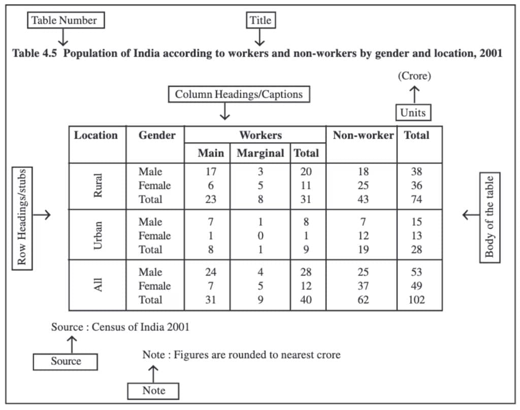
Parts of a Table
A good statistical table organizes data in rows and columns with explanatory notes. It can use one-way, two-way, or three-way classification based on the number of characteristics involved. A well-structured table should have the following parts:
(i) Table Number:
Assigned for identification, especially when multiple tables are used. It appears at the top or just before the title. For example, Table 4.5 is the fifth table of the fourth chapter.
(ii) Title:
Describes the contents of the table clearly and concisely. It should be placed below the table number.
(iii) Captions (Column Headings):
Headings are given at the top of each column to explain the data within.
(iv) Stubs (Row Headings):
Headings are provided for each row, appearing in the left column known as the stub column.
(v) Body of the Table:
The main part contains actual data. Each data point's location is determined by its row and column.
(vi) Unit of Measurement:
Indicates the units used for the data (e.g., crores, percentages). It should be mentioned in the title or within the table if different units are used.
(vii) Source:
Mentions the origin of the data. If multiple sources are used, all should be listed at the bottom of the table.
(viii) Note:
Provides additional information or explanations about the data if needed.
Diagrammatic Presentation of Data
This is the third method of presenting data, and it offers the quickest way to understand information compared to tables or text. By turning numbers into visual forms, it makes complex ideas easier to grasp.
While diagrams may not be as accurate as tables, they are much more effective in conveying information. The most common types of diagrams include:
(i) Geometric Diagrams
(ii) Frequency Diagrams
(iii) Arithmetic Line Graphs
Diagrams are powerful tools for simplifying and explaining data.
Geometric Diagram
Bar diagrams and pie diagrams are the most common types of geometric diagrams.
Bar Diagram
A bar diagram, also known as a bar graph or bar chart, is a visual way to show grouped data using rectangular bars that are all the same width but have different lengths. The height or length of each bar reflects the value of the data it represents. Bar diagrams can be used for both frequency-type and non-frequency-type data, making them effective for comparing amounts and simplifying how frequency distribution tables appear.
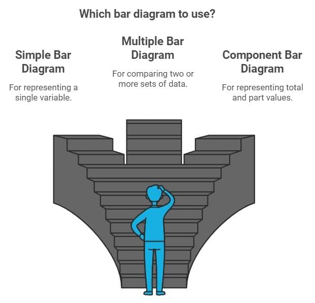
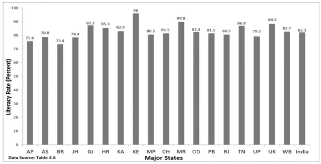
Simple Bar Diagram
A simple bar diagram uses rectangular bars of equal width and equal spacing to represent data for different categories or classes. The height or length of each bar shows the magnitude of the data, and all bars start from the baseline, usually from zero.
- Purpose: To compare data across categories quickly by visually comparing the heights of the bars.
- Type of Data: Can be used for both frequency and non-frequency data.
- Examples of Data:
- Frequency Data: Family size, grades, or spots on a dice.
- Non-Frequency Data: Income-expenditure profiles, literacy rates, population of states, etc.
The taller the bar, the higher the value it represents. For example, if the literacy rate of Kerala is represented by a taller bar than that of West Bengal, it indicates that Kerala has a higher literacy rate.
Simple bar diagrams are particularly useful for time series data, like comparing food grain production over different years or showing decadal variations in work participation.
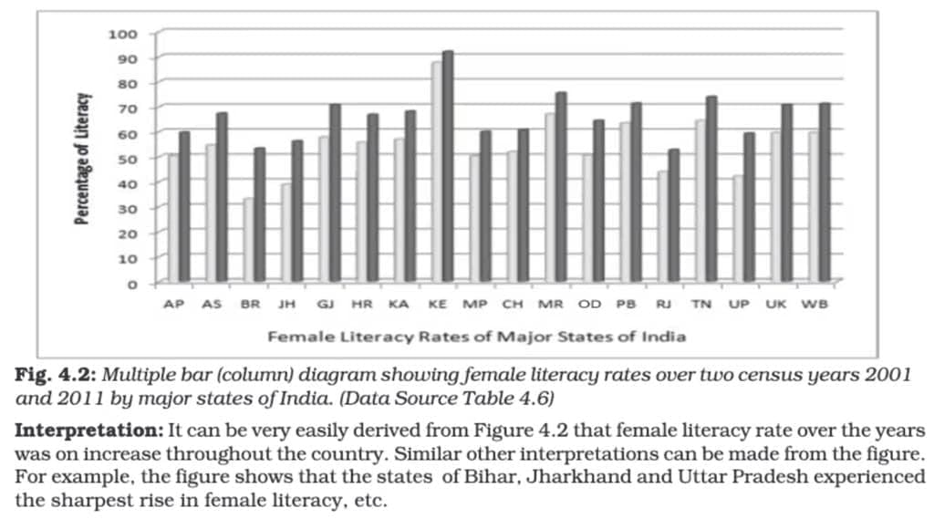
Multiple Bar Diagram:
Multiple bar diagrams are used to compare two or more sets of data side by side. Each set of data is represented by separate bars placed adjacent to each other for easy comparison.
- Purpose: Comparing related data, such as income and expenditure or import and export over different years.
- Examples: Comparing marks obtained in different subjects by students in different classes or comparing population growth across different states over time.
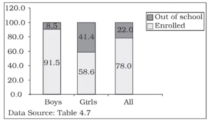
Component Bar Diagram
Component bar diagrams, also known as sub-diagrams, are used to show the breakdown of data into different parts and compare their sizes. The bars are divided into sections, each representing a component of the total.
These diagrams are helpful for comparing parts of a whole and understanding how each part contributes to the total.
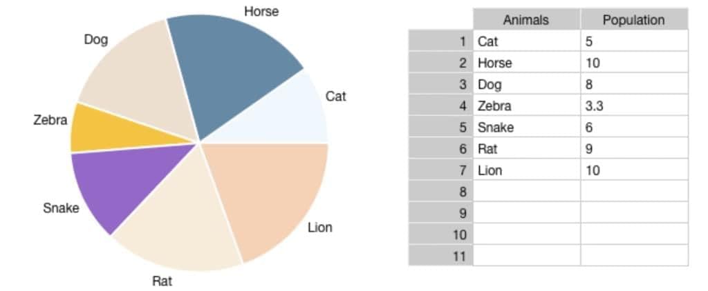
Pie Diagram or Pie Chart
A pie diagram, also known as a pie chart, is a type of component diagram where data is represented as a circle divided into proportional parts. Each part of the circle shows the share of a particular component in relation to the whole.
Construction:
- The circle is divided by drawing straight lines from the centre to the circumference.
- The values of each category are converted to percentages of the total.
- Since a circle has 360°, each percentage point is equal to 3.6° (360° ÷ 100).
- To find the angle for each component, multiply its percentage by 3.6°.
Comparison with Component Bar Diagrams:
- Pie charts and component bar diagrams both display parts of a whole.
- Pie charts are more visually appealing but less precise than bar diagrams.
- Bar diagrams work well with both absolute and percentage values, while pie charts require conversion to percentages.
Example:
If 40% of a family's budget is spent on food, the angle for this section of the pie chart will be:
40×3.6=144∘.
Pie diagrams are effective for comparing proportions and showing how different parts contribute to a total.
Frequency Diagram
Frequency diagrams are graphical representations used to showcase data in the form of grouped frequency distributions. They include Histogram, Frequency Polygon, Frequency Curve, and Ogive.
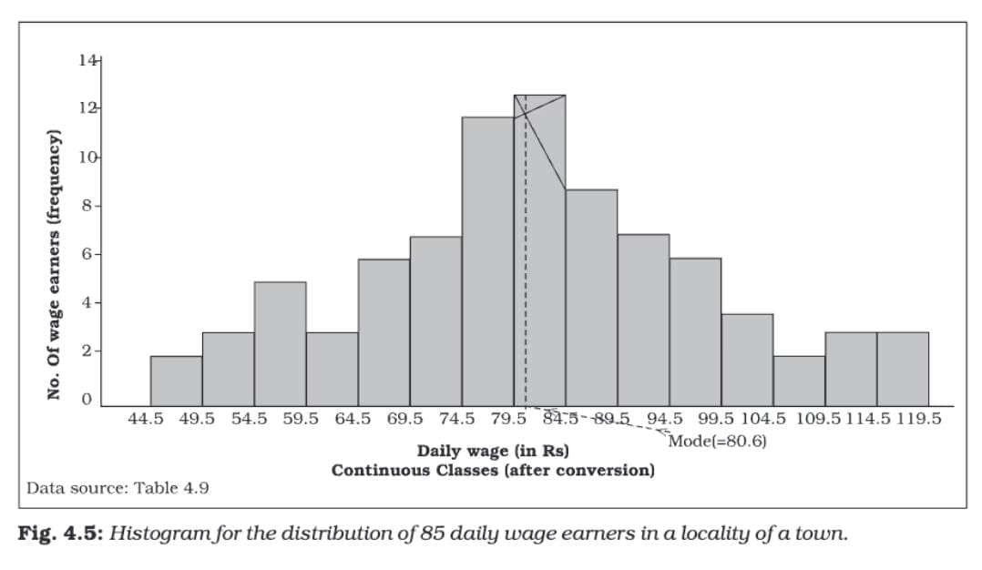
Histogram
A histogram is a two-dimensional diagram consisting of a series of rectangles. It is mainly used to represent continuous variables. The width of each rectangle represents the class interval, and the height represents the frequency or frequency density.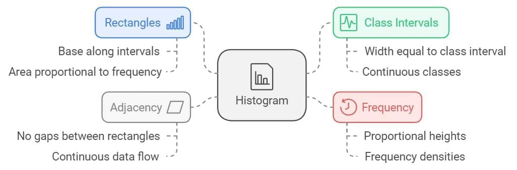
Construction:
- The rectangles are drawn on the X-axis with their bases corresponding to the class intervals.
- The height of each rectangle is proportional to the frequency of the class interval.
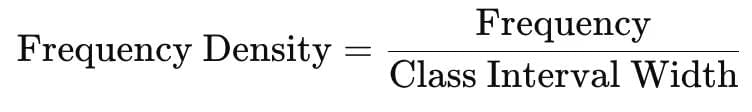
- If the class intervals are of unequal width, the height of the rectangle is calculated using frequency density, which is:
Characteristics:
- There are no gaps between the rectangles since the data is continuous.
- The width of the rectangles is as important as their height.
- Histograms can indicate the mode of a distribution graphically by identifying the highest rectangle.
Difference from Bar Diagram:
- Bar Diagram: Used for discrete variables, with gaps between bars.
- Histogram: Used for continuous variables, with rectangles touching each other.
- In bar diagrams, only height matters. In histograms, both height and width are important.
Use Case:
- Histograms are suitable for showing the distribution of continuous data like age groups, income ranges, or marks scored in an exam.
A histogram gives a clear visual representation of the frequency distribution and helps identify patterns, trends, and the mode of the data.
Frequency Diagram
Frequency diagrams include Frequency Polygon, Frequency Curve, and Ogive. These diagrams are useful for presenting grouped frequency distributions.
Frequency Polygon
A frequency polygon is a line graph created by connecting points that represent the frequencies of class intervals.
Construction:
- Midpoints of the tops of rectangles in a histogram are joined by straight lines.
- If there's no histogram, the midpoints of the class intervals are plotted on the X-axis against their frequencies on the Y-axis.
- The line is extended by connecting the first point to the mid-value of the previous class (with zero frequency) and the last point to the mid-value of the next class (with zero frequency).
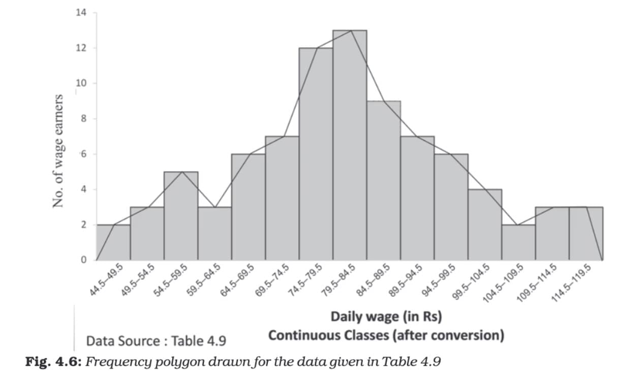
Characteristics:
- Easier to compare multiple distributions on the same graph.
- Suitable for showing overall shapes and trends.
- The area under the polygon represents the total frequency of the distribution.
Frequency Curve
A frequency curve is a smooth, freehand curve drawn to pass as closely as possible through the points of a frequency polygon.
Construction:
- Instead of connecting points with straight lines, a smooth curve is drawn to pass through or near the plotted points.
- The curve should ideally flow smoothly without sharp angles.
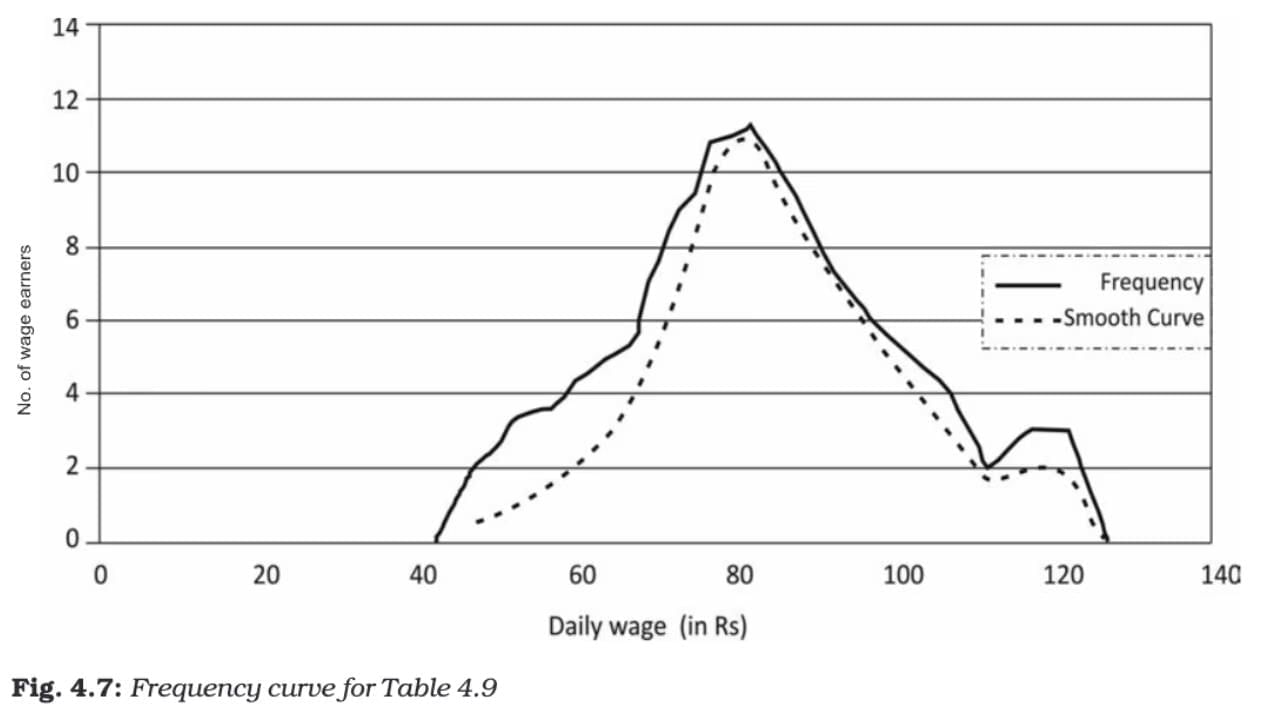
Characteristics:
- Useful for identifying general patterns and trends.
- Can be used to estimate frequencies for values not specifically included in the original data.
Ogive (Cumulative Frequency Curve)
An ogive is a graph that represents the cumulative frequencies of a dataset. There are two types: Less than Ogive and More than Ogive.
Construction:
- Less than Ogive: Cumulative frequencies are plotted against the upper-class limits.
- More than Ogive: Cumulative frequencies are plotted against the lower-class limits.
- The two curves can be drawn on the same graph for comparison.
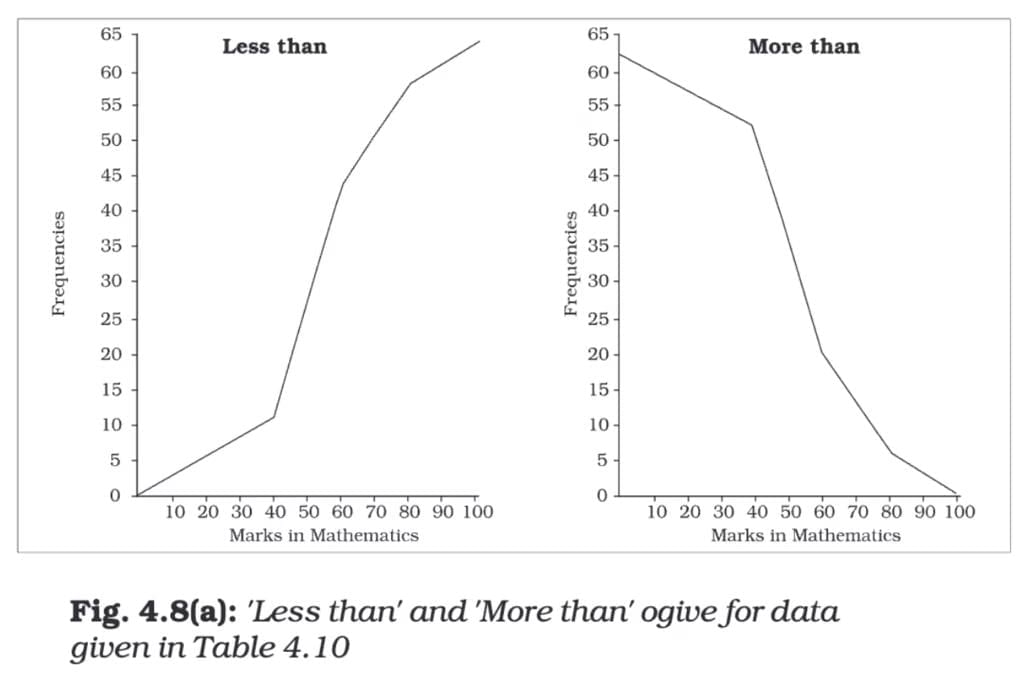
Characteristics:
- The Less than Ogive keeps increasing as you go right because it's showing cumulative frequencies that keep adding up.
- The More than Ogive keeps decreasing as you go right because it starts with the total frequency and keeps subtracting frequencies.
- Where these two lines meet (intersect) is the point where half of the data lies below it and half lies above it.
That's why the X-coordinate of this intersection point gives the Median. It's the middle value when all data points are arranged in order.
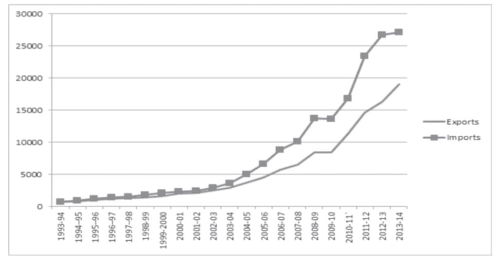
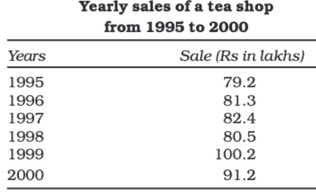
Arithmetic Line Graph
An Arithmetic Line Graph, also known as a Time Series Graph, is a graph used to show how data changes over time.
Construction:
- X-axis: Represents time, such as hours, days, months, years, etc.
- Y-axis: Represents the value of the variable being measured, like sales, temperature, population, etc.
- Plotted Points: Each point on the graph shows the value of the variable at a specific point in time.
- Connecting the Points: After plotting all the points, they are connected by straight lines to form a line graph.
Purpose of an Arithmetic Line Graph:
- It shows trends or patterns over a period of time.
- Helps us see if the data is increasing, decreasing, or remaining constant over time.
- Allows comparison of two or more variables on the same graph (like comparing imports and exports).
Example:
Suppose you have data showing the imports and exports of a country from 1993-94 to 2013-14.
- X-axis: Years (1993-94, 1994-95, …, 2013-14)
- Y-axis: Amount of imports and exports.
- The lines for imports and exports are plotted separately but on the same graph for easy comparison.
- If the line for imports is always above the line for exports, it means imports were always greater than exports.
- If the gap between the lines keeps increasing, it shows that the difference between imports and exports is growing over time.