Bar Charts | Year 7 Mathematics IGCSE (Cambridge) PDF Download

Key points
 Image caption,
 - A bar chart is a type of graph used to represent non-numerical or discrete data. It utilizes bars of varying heights to show the frequency of each category.
- The bars in a bar chart visually represent how often something happens or is present in a given dataset.
- Unlike line graphs, which show continuous data, bar charts are ideal for displaying discrete data sets with specific values.
- Each bar in the chart corresponds to a category, making it easy to compare different categories within the dataset.
- The vertical axis typically represents frequency, while the horizontal axis is labeled based on the data being presented.
- It is important to include gaps between the bars in a bar chart to avoid visual confusion.
Understanding Data Types
- Non-Numerical Data: Data that is not in numerical form, such as words or categories.
- Discrete Data: Data that takes on specific values, often whole numbers like counts. For instance, the number of siblings or shoe sizes are examples of discrete data.
- Frequency: Refers to the number of times a particular event or value occurs within a dataset.
Key Points:
- It can be used to make comparisons between the categories in a set of data.
Explanation:
When we talk about non-numerical data, we are referring to information that cannot be expressed in numerical terms, such as names, colors, or types of animals. On the other hand, discrete data consists of distinct values that are typically whole numbers. For example, if we are counting the number of students in a class, we are dealing with discrete data because you can't have a fraction of a student.
Frequency is a measure of how often a particular value or event occurs within a dataset. For instance, if we are recording the number of times a student visits the library in a month, the frequency would be the count of these visits. Understanding frequency helps us analyze patterns and trends within our data.
Comparisons between categories in a dataset are essential for drawing meaningful insights. By utilizing data types effectively, we can compare different groups or classifications to identify relationships or disparities. This comparative analysis is crucial in fields such as statistics, economics, and social sciences.
Examples:
Let's consider an example to illustrate these concepts. If we are looking at a dataset of students' grades (A, B, C, etc.), the grades themselves represent non-numerical data. However, if we are counting the number of students who received each grade, that would be discrete data. The frequency, in this case, would tell us how many students received each grade, helping us understand grade distribution.
Another example could be analyzing the frequency of car accidents in different regions. By categorizing the data based on location and comparing the frequencies, we can identify areas with higher accident rates, leading to targeted interventions for improving road safety.
Conclusion:
In conclusion, understanding different data types like non-numerical data, discrete data, and frequency is fundamental in data analysis and statistics. By grasping these concepts, we can organize, interpret, and draw meaningful conclusions from diverse datasets, enabling informed decision-making across various fields.
Representation of Data in Bar Charts
- The vertical axis in a bar chart typically represents the frequency of data points. This axis runs vertically (up-down) from the origin.
- The horizontal axis in a bar chart is labeled based on the specific data being represented. It runs horizontally (left-right) from the origin.
Key Points:
- The labeling on the horizontal axis of a bar chart depends on the nature of the data being depicted.
- A bar chart should include gaps between the bars to visually separate different data points.
It's essential to understand that the vertical axis of a bar chart typically shows the frequency or quantity of the data being represented, while the horizontal axis provides labels or categories for the data points. The presence of gaps between bars helps in distinguishing individual data sets clearly.
For instance, if we have a bar chart showing the sales figures of different products over a month, the vertical axis would display the sales numbers, and the horizontal axis would list the product names. By having gaps between the bars, viewers can easily differentiate the sales of each product.
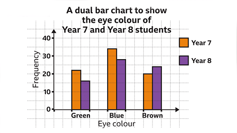 Image caption, Back to top
 Creating a bar chart
- Data Requirement for Bar Chart: To create a bar chart, data in tabular form is essential.
- Steps to Create a Bar Chart:
- Identify the Largest Frequency: Locate the highest frequency value in your table data.
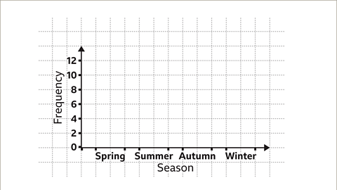
- Draw the Vertical Axis: On graph paper, draw a vertical line from the origin and scale it appropriately up to the highest frequency.
- Determine Categories for Horizontal Axis: Assess the number of categories needed for the horizontal axis.
- Draw Bars: Draw bars of correct height based on frequencies, ensuring gaps between them.
- Label Axes and Title: Properly label both axes and provide a title for your bar chart.
Creating a Bar Chart
- Look for the largest frequency in your dataset.
- Draw a vertical axis on your graph paper, ensuring it runs from the origin.
- Choose a suitable scale for the vertical axis and label it up to the highest frequency.
- Determine the number of categories needed for the horizontal axis.
- Sketch and label the horizontal axis, leaving space for gaps between bars.
- Construct each bar to the correct height based on the frequencies.
- Verify the accuracy of labels for both axes and provide a title for your bar chart.
Explanation and Examples:
- Finding the Largest Frequency: Identify the most frequently occurring value in your data. For instance, if you have a dataset of student test scores where "5" appears most often, that would be your largest frequency.
- Drawing the Vertical Axis: The vertical axis, running from the bottom to the top of your graph paper, helps represent the frequencies accurately. Imagine plotting a graph of the number of rainy days in a month.
- Choosing a Scale: If your largest frequency is 50, you might decide that each square on the graph paper represents 10 units.
- Determining Categories for the Horizontal Axis: If you are plotting types of fruits, and you have five categories (apple, orange, banana, mango, and pineapple), you need five spaces on the horizontal axis.
- Drawing Bars: If apples occur 10 times and oranges 6 times, the height of the bars representing these fruits should reflect these frequencies.
- Labeling Axes and Title: Ensure that your axes are clearly labeled with appropriate units, and give your chart a title that summarizes the data being represented.
Bar Chart Construction
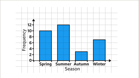
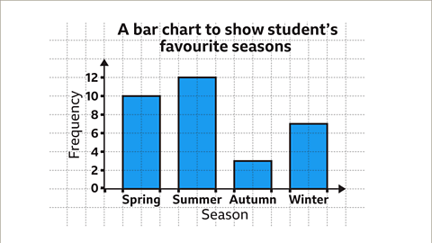
In a survey, 32 students were asked about their favorite season.
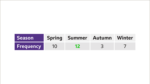
The survey results were as follows: Spring (10), Summer (12), Autumn (3), Winter (7).
To create a bar chart representing these results, follow these steps:
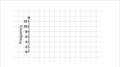
- Identify the largest frequency, which in this case is 12.
- The vertical axis should accommodate at least up to the largest frequency (12).
- Draw the vertical axis and label it with regular intervals, such as increments of two.
- Label the vertical axis as "Frequency".
- For the horizontal axis, include four categories corresponding to the seasons.
- Ensure each bar on the chart has the same width, with proper gaps between them.
- Label each bar and the horizontal axis appropriately.
Examples
Image gallerySkip image gallery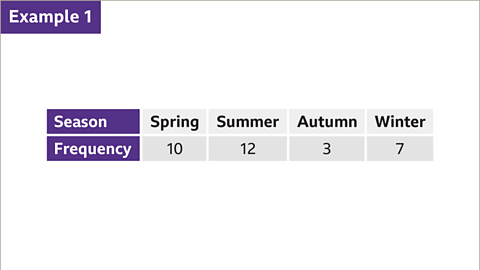

Creating Bar Charts
Constructing Bar Heights
When visualizing data in a bar chart, it's crucial to assign appropriate heights to the bars based on the corresponding frequencies. For instance, if we consider a bar representing 'spring' with a frequency of 10, it should be positioned between even numbers on the vertical axis, ensuring that bars for odd numbers align midway between adjacent even numbers. Similarly, the bar for 'autumn' with a frequency of 3 should be placed between 2 and 4 on the axis.
Labeling the Graph
After drawing the bars accurately, it's essential to provide the graph with a suitable title that succinctly describes the data being presented. For instance, in a bar chart showcasing students' favorite seasons, a fitting title would be 'A bar chart to show students' favorite seasons.'
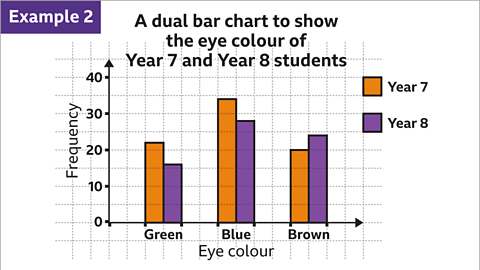
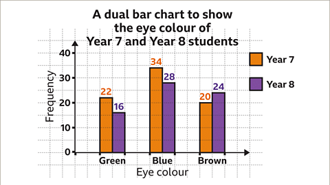
Interpreting Dual Bar Charts
Dual bar charts offer a method to compare data effectively. For example, a dual bar chart displaying the eye colors of year 7 and year 8 students can provide insights into trends and differences between the two groups. Each pair of bars, color-coded for clarity, represents the frequencies of different eye colors, allowing for easy comparison between the two years.
 |  |
 |
Understanding Dual Bar Charts
- By examining the vertical axis of a dual bar chart, we can interpret the frequency of each bar. The axis increments by 10, with ten subdivisions between each multiple of 10, where each subdivision represents a value of 1. For instance, in Year 7, there are 22 students with green eyes.

Calculating Total Students in a Year Group
- To determine the total number of students in a specific year, such as Year 7, we can add up the frequencies of the bars representing that year. For example, adding 22, 34, and 20 for Year 7 gives us a total of 76 students in that year.

Finding the Modal Eye Colour
- By summing the frequencies of the bars for each eye color, we can determine the most common eye color, known as the mode. For instance, in Year 7 and 8 combined, the modal eye color is blue with 62 students having blue eyes.
Slide 1 of 10: Example One
- An image displays a table with two rows and five columns.
- The first row is titled "season" and includes: spring, summer, autumn, and winter.
- The second row is labeled "frequency" with the values: ten, twelve, three, and seven.
- The label cells are highlighted in purple.
- 32 students were surveyed about their favorite season, and the table presents the responses.
Questions
- What data does the table represent?
- How is the information in the table useful?
Practise working out bar charts
Practise working out bar charts with this quiz. You may need a pen and paper to help you with your answers.
Quiz
Real-life maths

A geographer, a scientist who studies both the Earth's natural environment and human society, may use climate graphs to study changes in weather patterns in regions of the world. One type of climate graph shows precipitation or rainfall. This takes the form of a bar chart with the rainfall for each month being represented as a bar. The height of the bar indicates the quantity of rainfall during that month.
Game - Divided Islands
Summary in Bullet Points:
- Climate Graphs: Used by geographers to study weather patterns.
- Precipitation Display: Shows rainfall for each month in a bar chart.
- Bar Height Significance: Indicates the amount of rainfall for a specific month.
|
28 videos|77 docs|22 tests
|


MCQs
,study material
,Bar Charts | Year 7 Mathematics IGCSE (Cambridge)
,Sample Paper
,Exam
,Bar Charts | Year 7 Mathematics IGCSE (Cambridge)
,Viva Questions
,Important questions
,Extra Questions
,practice quizzes
,ppt
,Free
,Summary
,Bar Charts | Year 7 Mathematics IGCSE (Cambridge)
,shortcuts and tricks
,video lectures
,Previous Year Questions with Solutions
,Semester Notes
,past year papers
,mock tests for examination
,Objective type Questions
;


Bar Charts Free PDF Download
Importance of Bar Charts
Bar Charts Notes
Bar Charts Year 7 Questions
Study Bar Charts on the App
|
© EduRev
|
Education Revolution
|


|


within 7 days!